Logo
Our brand should promote a feeling of experimentation, excitement and building something ethical and dynamic.
Before we agreed on a final logo concept we went through multiple iterations of various concepts. We explored various ideas in depth before settling on the final logo concept.
 Download Logo
01. Logomark Construction
In the end we came up with a logomark that combines several simple principles which translate well to the voice of the brand.
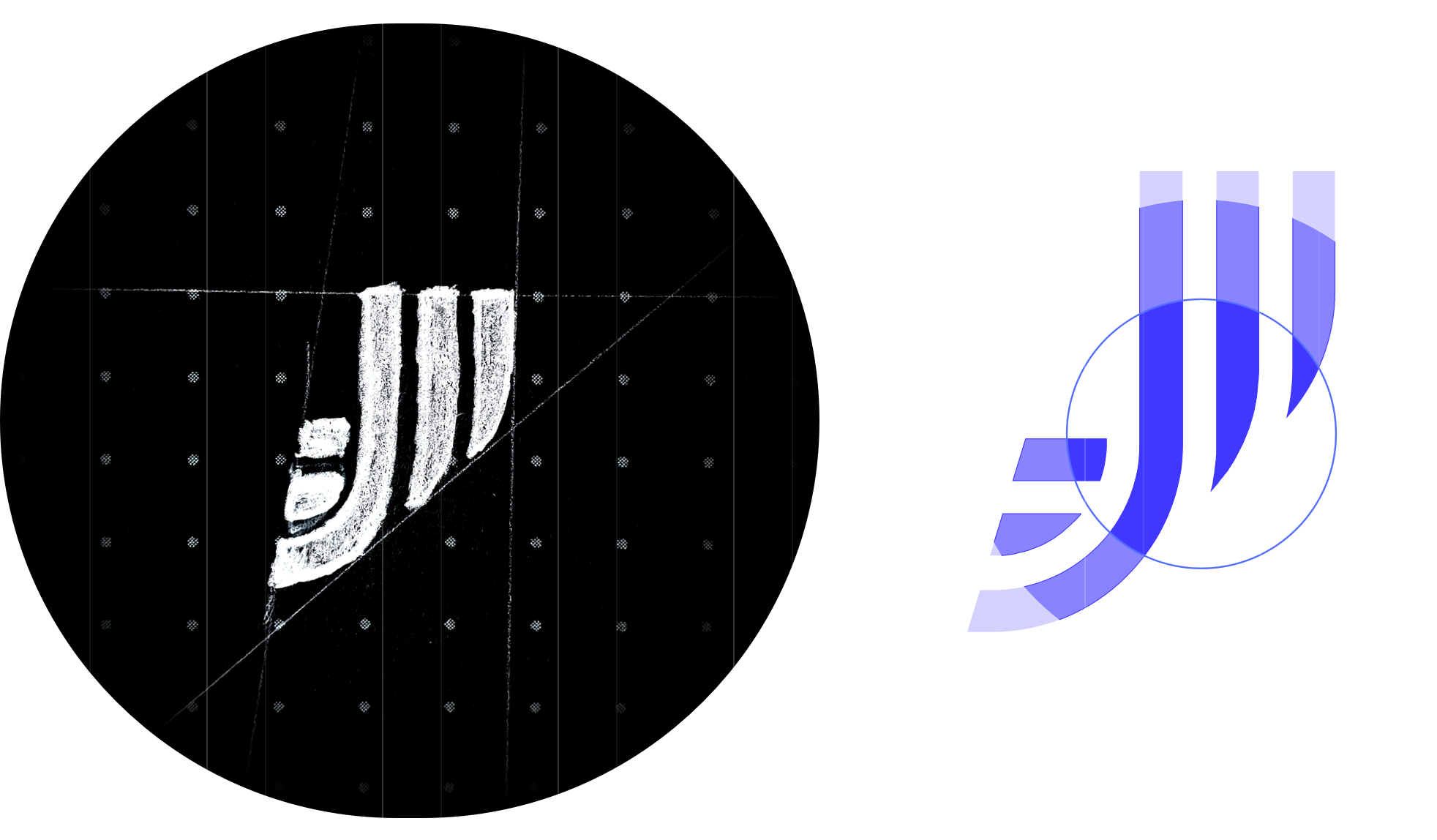
Our logomark is a combination of the letter J (to represent the name Joystream) and three parallel stripes that are a representation of streaming data and the flow of information and technology.
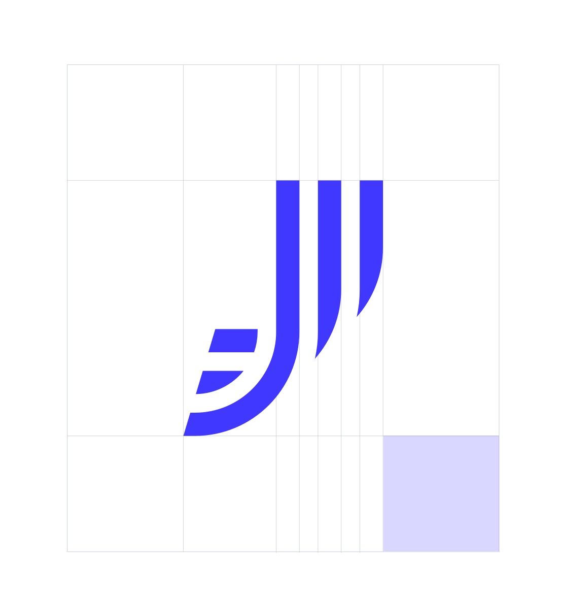
Logomark's exclusion zone is equal to the blue square height (marked as 5a in the diagram).
02. Logo Construction
The Joystream logo is a combination of the logomark and dedicated typography that was designed to be the best link between the logomark and what Joystream stands for. It is firm and technical but shows plasticity and sense of a structure.
Horizontal Lockup
Vertical Lockup
03. Logo Use Cases
The Joystream logo is primarly used in its original form on white backgrounds but it can also be used in its complimentary forms if necessary. Examples show such use cases below.
The smallest safe use
In order to ensure the best visual presentation of the logo, it is best offered in sizes between 200 and 500+px width on digital devices.
04. Social Icons
In cases when the Joystream brand has already been established we can simply use the icon on its own. While the icon can exist without the wordmark, the wordmark should never exist without the icon.
05. Forbidden uses of the logo
The logotype and the icon must follow certain rules and there are general cases of use that should be avoided at all costs! In order to preserve the brand voice remember to avoid examples such as the following:
Color Palettes
Our brand colors combine three primary colors: black, white and blue. They define the mood and present brand values including:
Stability, Trust, Freedom, Responsibility, Loyalty, Wisdom, Confidence and Intelligence
01. Primary Colors
Our primarly used colors are black and Joystream blue, a distinctive color that helps to put focus and draw attention. The color white can be deployed in order to calm, provide clarity and offer improved readability.
One additional color to combine with the three primary colors is blue tinted grey, its purpose is comparable to that of white but it also gives a good amount of contrast to the existing white elements where necessary.
Joystream Blue
White
Joystream Grey
Black
02. Supportive Color Palette
Our supportive palette serves the purpose of convenience and usability. This pallete provides a comprehensive range of different shades of primary colors and can be utilised in many different ways depending on requirements.
03. Secondary Color Palette
These are further colours that can represent certain states of the network, they can stand for an error, success, warning and more.
Iconography
Icons can be divided into two groups with different purposes. Descriptive icons are a substitute for illustrations and system icons are a purely functional part of the interface.
01. Descriptive
02. System
01. Descriptive Icons
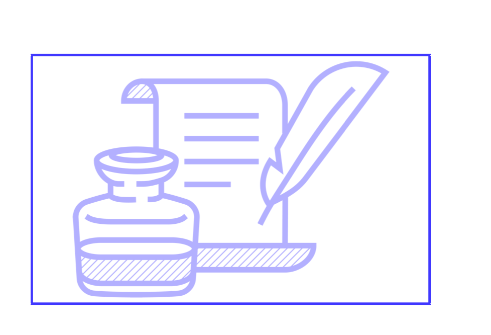
Joystream iconography is a custom, comprehensive icon style that helps in explaining certain complex topics in a simple, digestable manner.
They are not always very direct and often carry a symbolic meaning but they help to emphasize important elements.
Construction
Characteristic features of the descriptive icons include paralell striped fills. They are a translation of logo stripes and represent shadows.
Lines have an angle of 45° they should have 2px girth and 8px space between them at 100% scale.
Icons are drawn using outlines of 12px width at 100% scale, they have square linecaps and can have various sizes depending on the composition.
02. System Icons
System icons in their basic style combine two colors: black and Joystream Blue. Their purpose is to represent certain actions on the website or platform. They are readable even in small sizes down to 18x18px.
Construction
System Icons are drawn using 2px strokes with square linecaps on a 24px grid frame.
Where possible, icons should have subtle blue accents representing no greater than 40% of the whole.
Types of system icons
We distinguish four types of system icons and they should be used preferably in their basic style but can be used interchangeably where neccessary.
Basic style
Blue outlines
White outlines
Full style
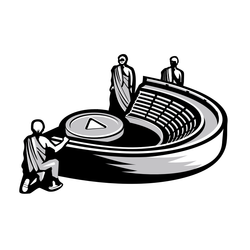
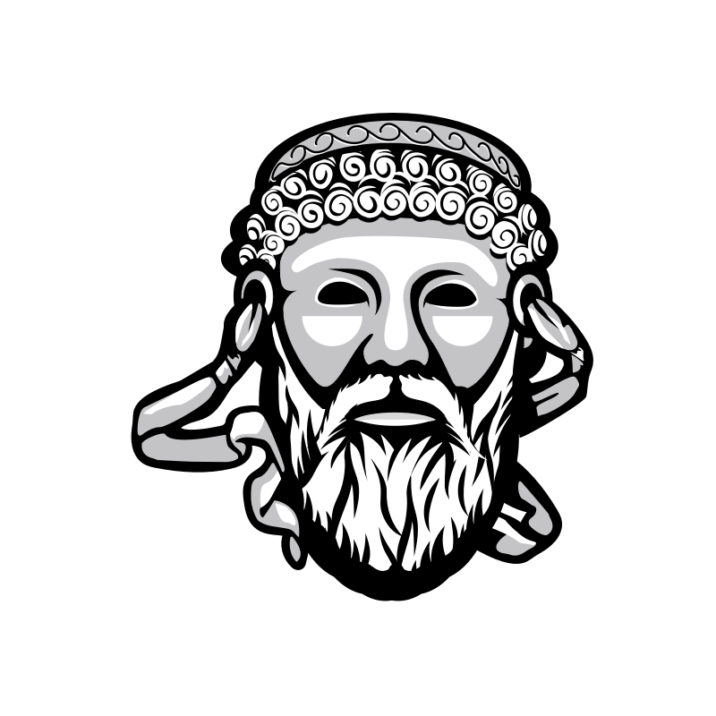
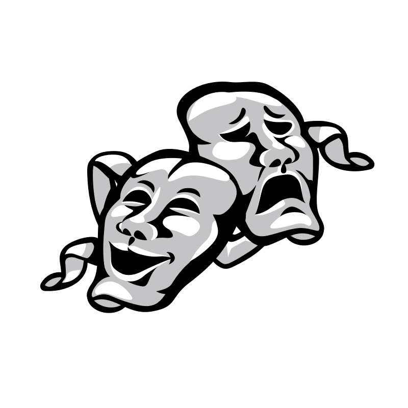
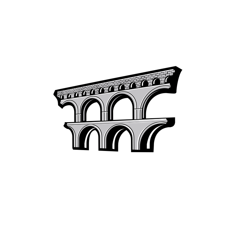
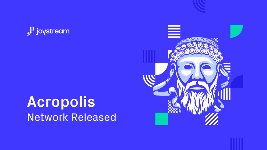
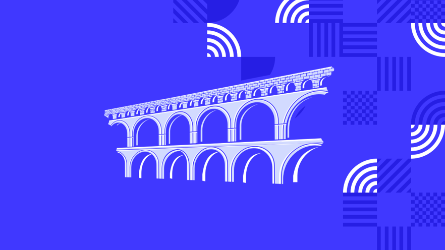
Illustrations
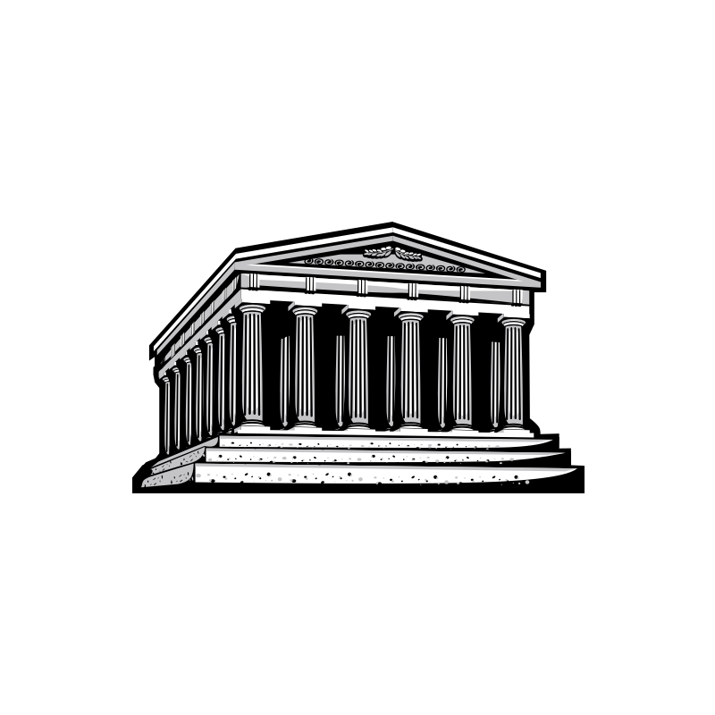
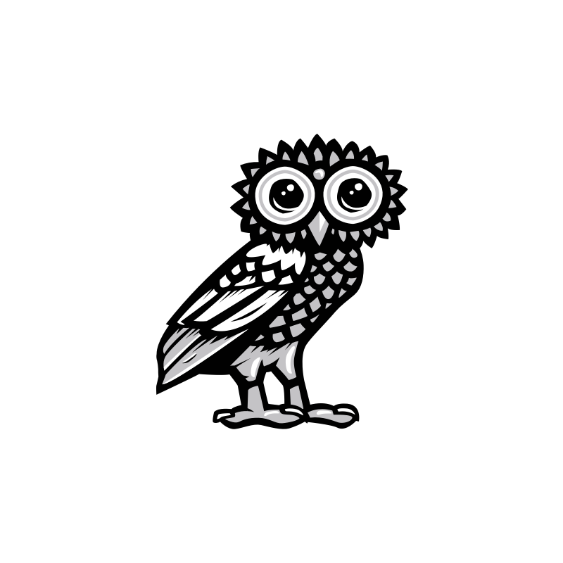
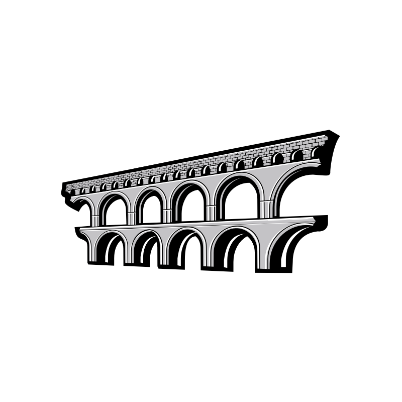
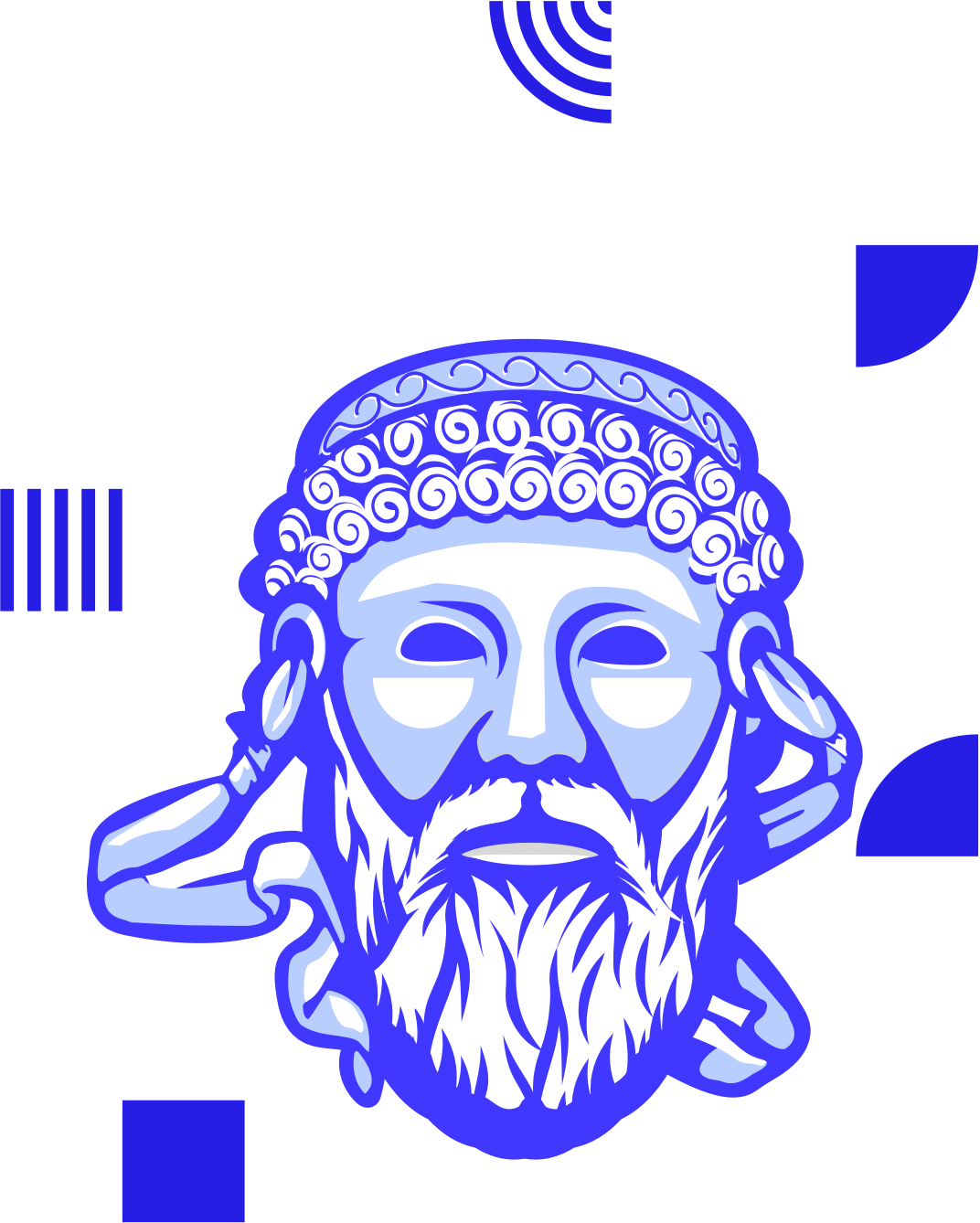
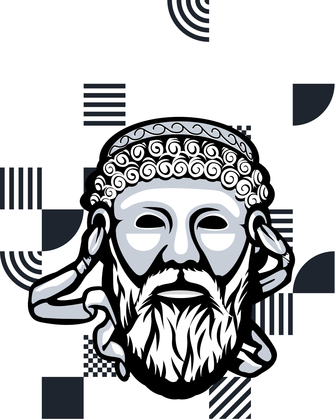
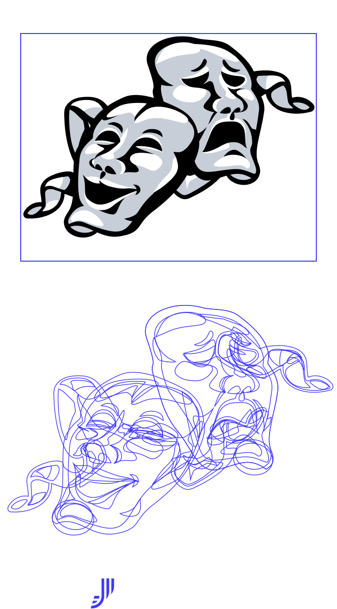
Joystream Illustrations are symbolic representation of important concepts within the Joystream project. These might include a a new testnet, a particular role on the network or any other equally significant subject.
They can be quite visualy complex despite using only three colors and no gradients.
Construction
Illustrations will often be combined with patterns and in the case of putting them on a blue background, the outline of the illustration can be changed to Joystream Blue in order to create a good color balance between patterns and the background.
Construction
Illustrations should be simple enough to be distinctive even in smaller resolutions down to 300x300px.
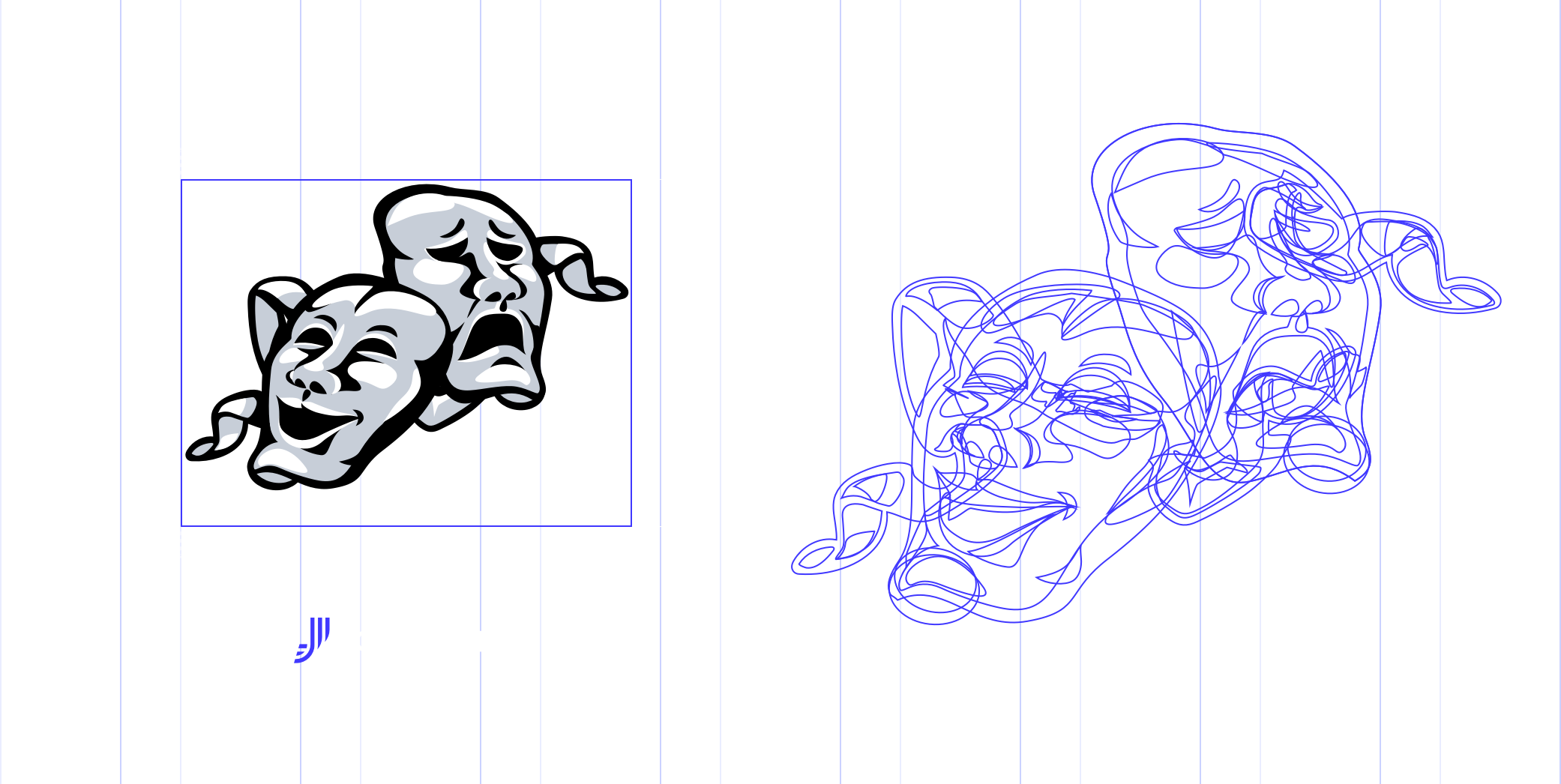
The amount of detail should be adequate to what the illustration represents, in most cases they should be deployed at sizes no smaller than 500x500px.
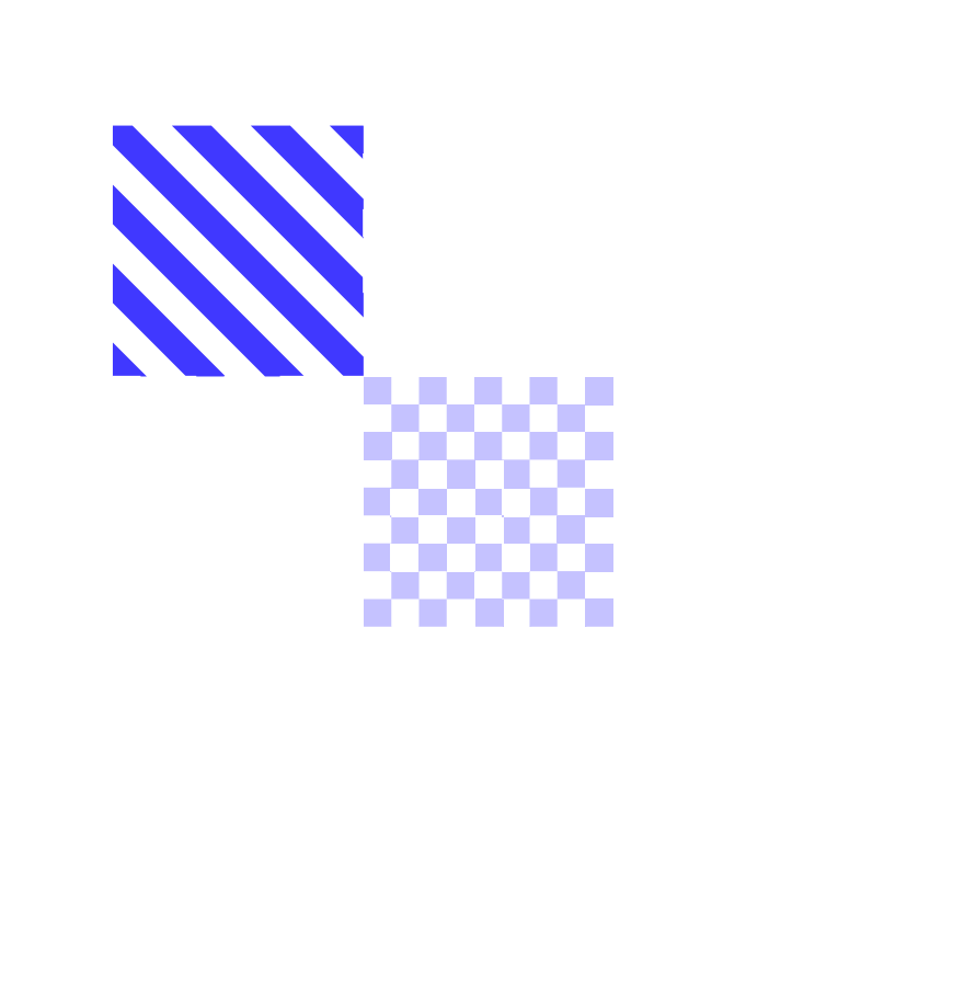
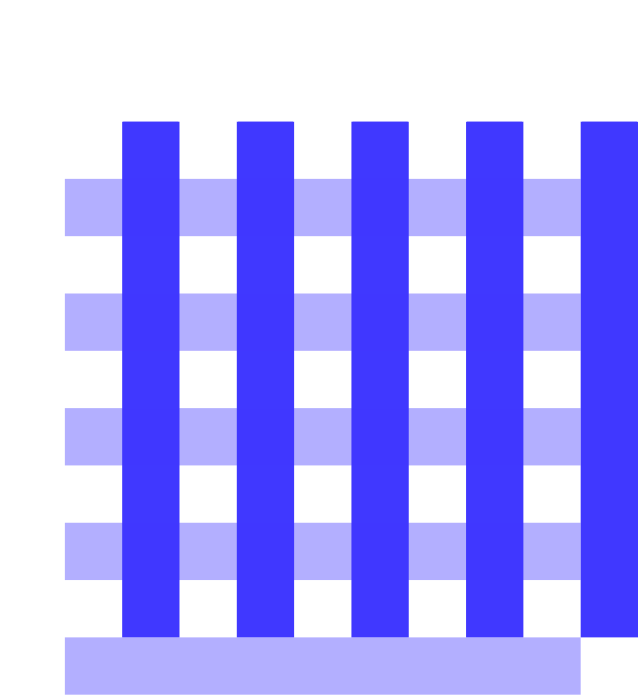
Patterns
Patterns are close translation of the logomark (J) into variants of geometrical shapes representing the flow of information, technology and Joystream's experimental brand personality.
They were introduced as a support tool to make certain elements stand-out, to build mood and as an inherent element of the visual identity of the brand.
Construction
Patterns visually consist of six different pieces that can be rotated by 90 degrees in any direction and should always have the dimensions of a perfect square.

They should also have at least one common vertex when they touch. They do not always have to touch and when they don’t, space between pieces should always be equal to its’ width/height or the value multiplied.
How to use patterns
Patterns can use one of five different colors depending on what background is used beneath and what their main purpose is in a given situation.

Depending on the situation these can be used more or less densely.

Patterns in use - examples

Typography
Our typefaces are simple, comprehensive and modern. This is a reflection of our brand and our voice. We chose the appropriate typeface weights from PX Grotesk (regular, bold) and Inter family for specific touchpoints and to create clear hierarchies of information and messages.
If either two typefaces are impossible to use please choose Arial Regular. This may be required across PC operating systems or electronic internal documents or in diferent offices worldwide. Don’t use Arial for any print materials.
The following is a sample of an ideal font stack using PX Grotesk for headlines and larger pull quote text and Inter UI for paragraph and call-to-action text.
/Regular, 54/80
The spectacle before us was indeed sublime.
/Regular, 40/48
Question marks and exclamation points.
/Regular, 40/48
Every introduction to the problems of aesthetics begins by acknowledging the existence and claims of two methods of attack.
/Regular, 32/40
Methodologies of Aesthetics
Users who also want to engage in actually running and guiding how the platform will work, in other words, people who want to engage in platform governance and work. This refers to people who enjoy building, fostering and participating in nascent communities. They are driven by a sense of purpose, and also the motivation to get in early on something that can become big and important. These people are often highly social, enjoy working in groups with common purpose, are self directed, digital natives and often outsiders in the offine world.
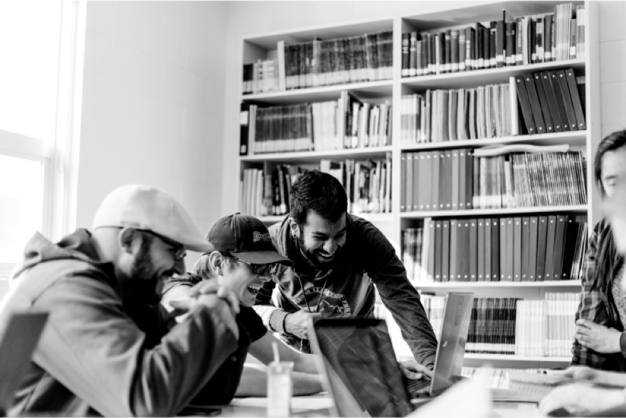
Photography
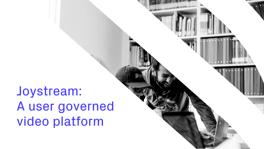
Photographs should be relevant to the topic they are describing but they shouldn’t be limited only to technology. Joystream is much more than just technology; it is unifying, fresh and joyful. Imagery should convey this mood to users.
How to use photography
Since Joystream is a unique and experimental project it provides a wide variety of the topics which might be associated with it in terms of photography. It is highly technical especially now when we are in the community building phase, so good deal of the photographs will be tech related.
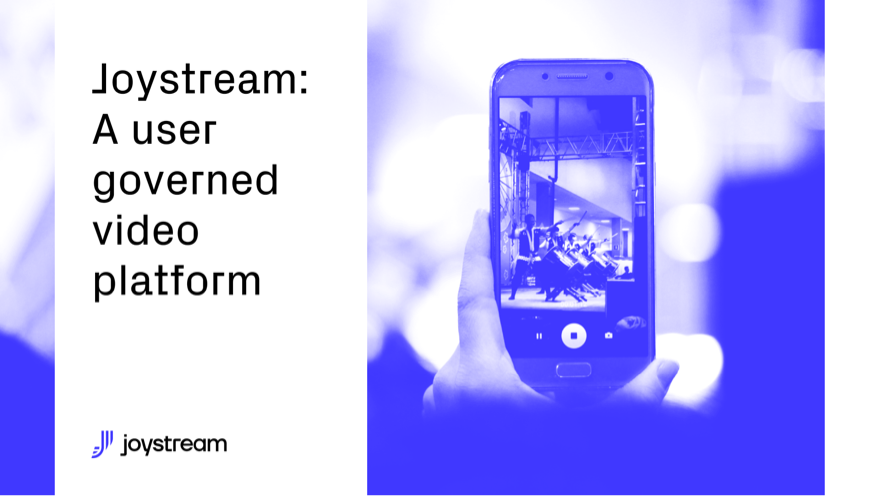
One way to make sure the photographs are consistent is to use them in dual tones deriving from branding colors. For that purpose we can use a handy tool to consistently change images to dual tones as described below.
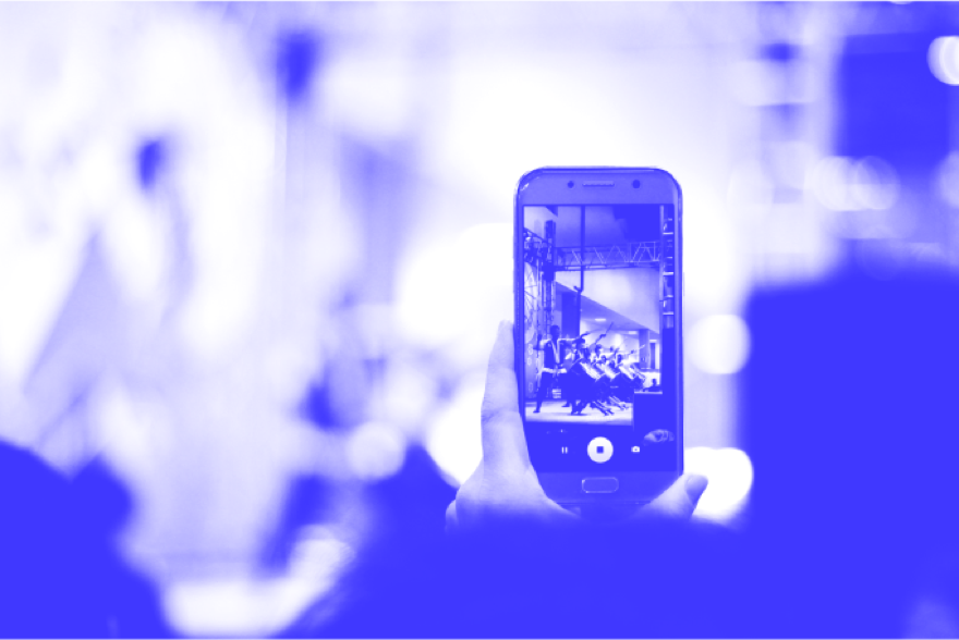
The link below allows you to create consistent duotones with any photography after inputing the proper two Joystream colours.
https://duotone.shapefactory.co/The mood that photos convey is extremely important. It should by all means give a feel of building trust, community and joy. Photographs should show good amount of diversity as it is meant to be for an extremely wide variety of users. They don’t have to be used in dual tones but it is best if they are not "screaming" with colours.
Photography in use - examples
Motion
Joystream is an experimental and exciting platform and its motion should be too.
General rules for motion can be described with a few simple principles: smooth transitions, dynamic but fluid motion and good amount of easing at the keyframes. This combination should provide a consistent and flexible animation style to cover most of the use cases.